
Draw shapes in a compose timeline
A shape clip draws a rect, ellipse, circle, triangle, diamond or any SVG path straight from JSON. Gradients, outlines with a real hole, drop shadows, rotation about the shape's own centre, feathered edges, and geometry, colour and rounding that animate.
A lower-third bar behind a title used to mean making a PNG, hosting it, and passing it as an image clip. So did a scrim, letterbox bars, a divider rule and a highlight box. Five of the most ordinary things in an edit, and every one of them started outside the API.
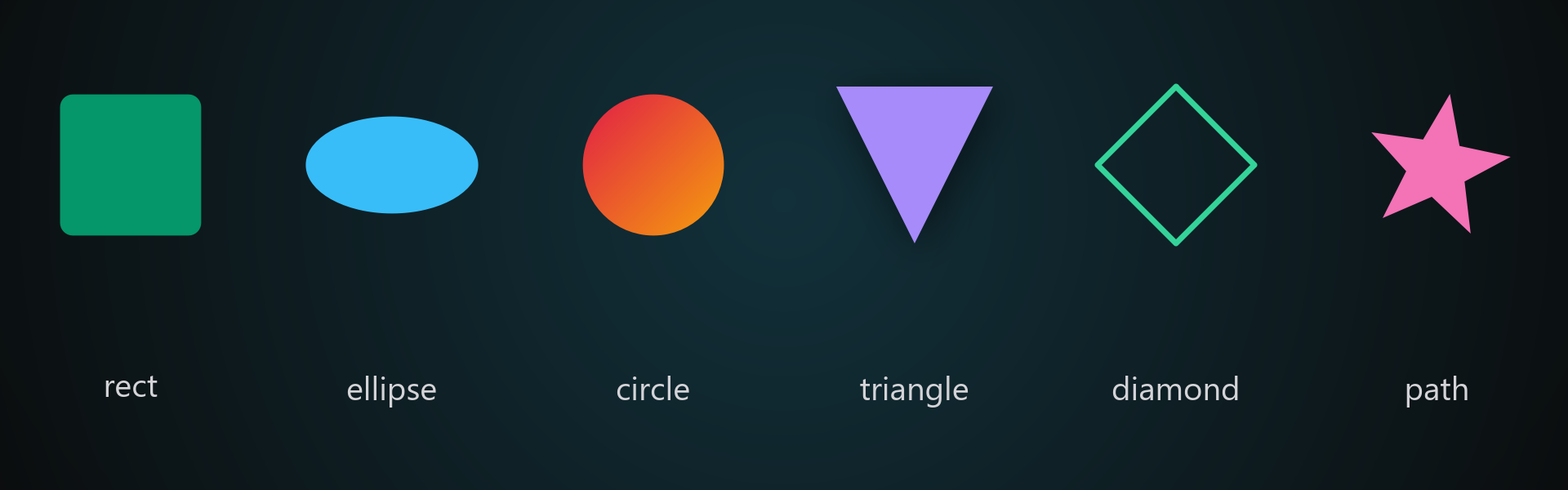
compose has a shape asset now.
{ "asset": { "type": "shape", "color": "#0A0A0ACC", "position": { "x": "50%", "y": "86%" }, "size": { "width": "100%", "height": "22%" } }}That is a translucent bar across the lower third: four fields, and only type and size are actually required. position is the centre of the shape by default, and there is no length, because a shape has no duration of its own and runs to the end of its container the way text and images already do.
Everything below is optional. The simple case stays simple.
Six kinds
shape takes rect (the default), ellipse, circle, triangle, diamond and path.
Leave size.height out and the shape is square in pixels. That is the whole trick to getting a real circle on a frame that is not square. A 10% by 10% box on a 16:9 frame is 192 by 108 pixels, so rounding it gives a pill. Omit the height and the engine derives 17.8% for you.
path takes SVG path data straight out of a design tool, with viewBox giving the space it was drawn in:
{ "type": "shape", "shape": "path", "viewBox": "0 0 24 24", "path": "M12 21C12 21 3 14.5 3 8.5C3 5.5 5.5 3 8.5 3C10.4 3 12 4.5 12 4.5C12 4.5 13.6 3 15.5 3C18.5 3 21 5.5 21 8.5C21 14.5 12 21 12 21Z", "color": "#E11D48", "position": { "x": "50%", "y": "50%" }, "size": { "width": "20%" } }Gradients, outlines and shadows
Give color two colours and it is a gradient, with gradient naming the direction. It maps to the shape, not the frame, so a small badge still shows the whole ramp instead of a sliver of one.
Leave color out and only the stroke draws, and what it surrounds is genuinely transparent rather than filled with black. Give it both and you get a filled shape with a border, on any kind except a path.
shadow is a drop shadow that follows the shape, including its outline, its rotation and its animation. Every field has a default, so "shadow": {} is a sensible one.
{ "type": "shape", "color": ["#FFFFFF", "#E5E7EB"], "radius": 0.3, "stroke": { "color": "#111827", "width": 3 }, "shadow": { "blur": 14, "x": 8, "y": 10 }, "position": { "x": "50%", "y": "50%" }, "size": { "width": "34%", "height": "40%" } }Rotation turns about the shape, not the frame
rotate is degrees clockwise about the shape’s own centre, so it spins where it sits instead of orbiting the middle of the frame. That is what makes a diagonal rule one field on a thin rect. softness feathers the edge, which turns an ellipse into a spotlight or a vignette rather than a hard-edged disc.
Everything animates
animateTo moves position, size, rotate, color and radius over the clip, linear by default or smooth for an entrance.
{ "type": "shape", "color": "#FFFFFF", "anchor": "topLeft", "position": { "x": "2%", "y": "86%" }, "size": { "width": "0%", "height": "1.5%" }, "animateTo": { "size": { "width": "96%" }, "easing": "smooth" } }That is a progress bar. A square can round off, a solid can become a gradient, and a badge can grow and turn at the same time.
anchor: "topLeft" in that example is the other half of the ergonomics: with it, letterbox bars are y: "0%" and y: "90%" at height: "10%" with no halving in your head.
Transparency belongs in the colour
color takes an 8-digit hex, so #0A0A0ACC is a scrim you can still read the footage through. Use that rather than the clip’s opacity for a constant translucency: opacity dims the fill as well as fading it, so a half-opacity white box renders grey. Keep opacity for animated fades.
Shapes take blendMode, blur, colour grading, opacity keyframes and transitions like any other clip, and a shape-only track composites as a base layer, so a solid colour background is a timeline that references no files at all.
A few combinations are refused rather than rendered wrong, each with a message naming the fix: radius is a rectangle feature, needs a fill, and cannot be combined with rotate or softness; stroke is not available on a path; and transform is refused on shapes entirely, because it moves the whole frame rather than the shape in it. Use position, size and rotate, which measure the shape itself.
Every field is in the compose job reference, and the compose API page has the wider tour.